Add your logo, app icon and wordmark
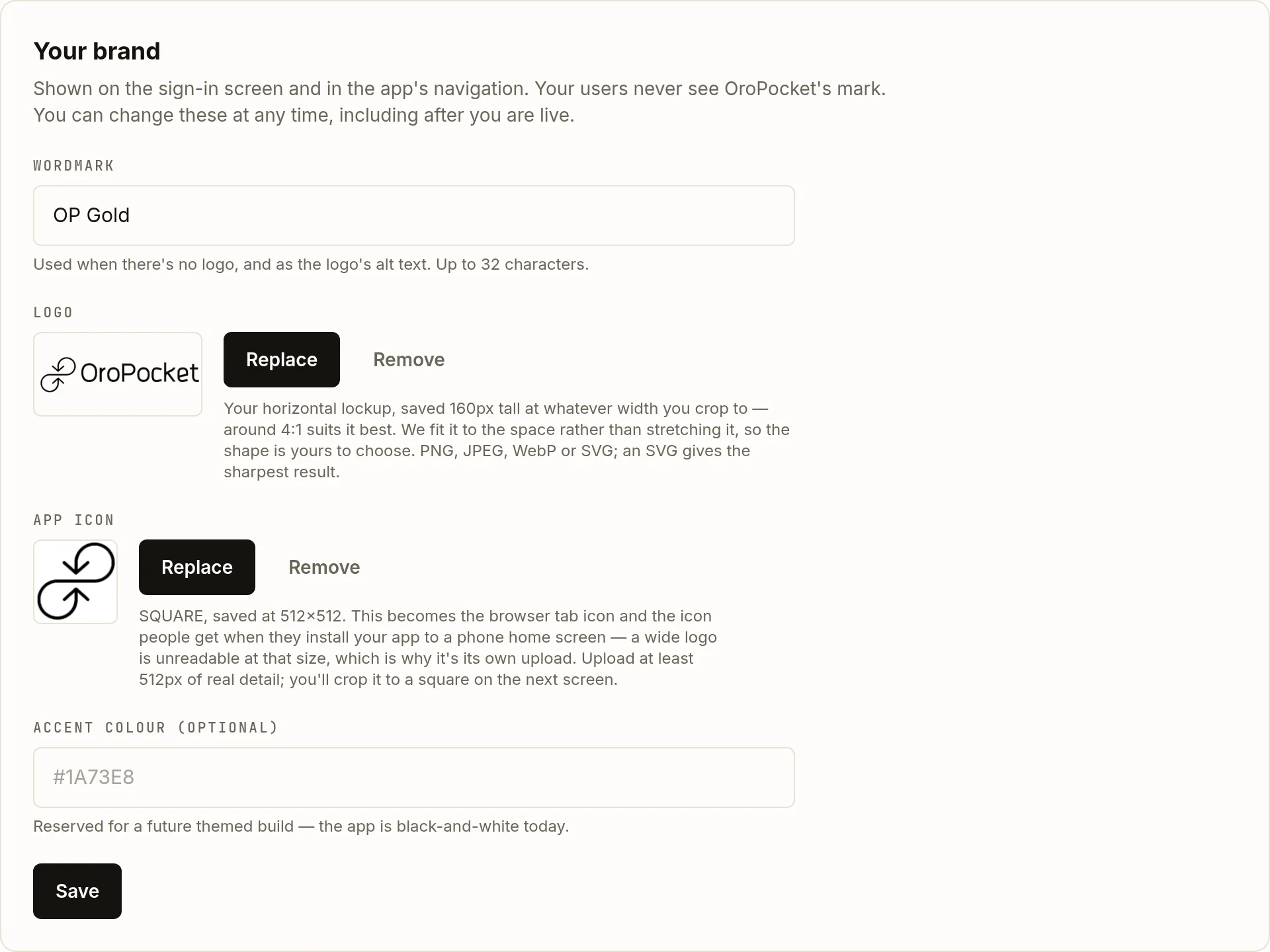
Your brand appears on the sign-in screen and throughout the app's navigation. There are two separate image uploads, and the reason they are separate is the thing most people get wrong.
On the Whitelabel page, the second card is Your brand. Unlike the domain, everything here stays editable for the life of the partnership — including after you are live.
| Field | Type | Description | |
|---|---|---|---|
| wordmark | string (32) | required | Your name in text. Used when there is no logo, and as the logo's alt text — so fill it in even if you upload a logo. |
| logo | PNG / JPEG / WebP / SVG | optional | Your horizontal lockup, for the sign-in screen and the app navigation. Saved 160px tall at whatever width you crop to; around 4:1 suits it best. A transparent background reads best. |
| app icon | PNG / JPEG / WebP / SVG | optional | The browser tab favicon and the icon someone gets when they install your site to a phone home screen. You crop it to a square and it is saved at 512×512, so upload something with at least 512px of real detail. |
| accent | #RRGGBB | optional | Reserved for a future themed build. The app is black and white today, so setting this changes nothing yet. |
Write the wordmark
Up to 32 characters. It is the fallback when there is no logo, and it is the alt text on the logo when there is one — so it is doing accessibility work whichever way you go.
Upload the horizontal logo
Upload opens a file picker, then a cropper. It starts on the whole image — nothing is trimmed unless you trim it — and you drag the box to choose how much to keep. Any width works: the app fits your logo to the space rather than stretching it. Files can be up to 25 MB, though a logo has no business being anywhere near that.
The cropper previews the three places your logo actually appears, at their real sizes: the app navigation at 160×32 and the loading screen at 220×56, both on white, and the sign-in panel at 200×40 on black. Check it reads on all three — a single-colour logo on a transparent background will vanish on one of them. Pick a solid background there if it does.
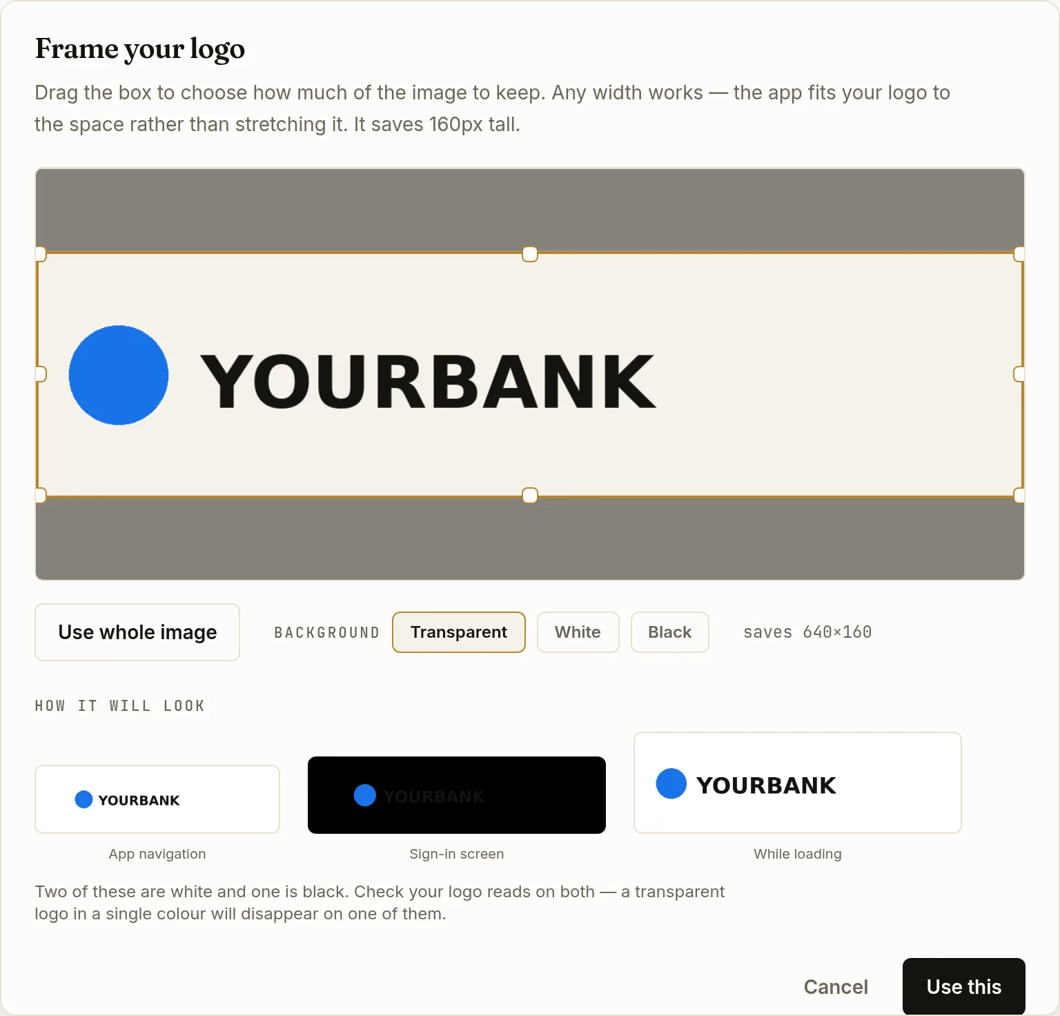
The warning is not hypothetical — this dark wordmark on a transparent background has all but vanished against the black sign-in preview. Switching the background to White fixes it. Upload a separate square icon
This is the one worth getting right. A wide lockup squeezed into a 16-pixel favicon is unreadable, and letterboxed on a phone home screen it looks broken — which is why it is its own upload rather than something we slice out of your logo. Give it artwork that works in a square: a monogram or a symbol, not your full name.
Its cropper locks to a square and saves at 512×512, and it previews at 16, 32, 64 and 180 pixels so you can see whether your mark survives the small end before you commit to it. It will tell you if the area you picked is too small to scale up cleanly.
Save
Before your domain is live, Save applies the change directly. Once you are live the button becomes Submit brand for review — see below.
Why editing a live brand goes through review
Once your domain is serving, a brand change is staged rather than applied. Your site keeps showing the approved brand while the new one waits, and an administrator copies it across on approval. There is no deploy and no downtime.
While a change is pending, the card shows a banner saying so. If it is rejected you get the reviewer’s note in red, and your live brand is untouched throughout.
What your users see, and what they do not
On your domain, your users see your wordmark and logo in the sign-in screen and the app navigation. They do not see OroPocket’s mark. What white-label does not give you is a native app in the stores, push notifications under your name, an independent release train, or a themed interface beyond the assets above — the whitelabel reference is explicit about the boundaries.